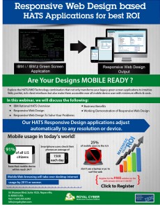
RWD HATS Applications For Best ROI
 Instead of designing separate HATS applications for every mobile device, it is better to design a Responsive Application by following RWD (Responsive Web Design) techniques. An RWD based application needs to be coded only once then it adjusts automatically for all mobile devices with varying factors like OS, platform, screen sizes, orientations, etc. Mobile devices usage is on all time high, so making your legacy green screen applications fitting all mobile devices is not a mere “good to have” feature. It is an absolute necessity to stay competitive.
In this webinar you will learn what HATS & Responsive Web Design is and how HATS-RWD combination helps the organizations reaching maximum audience with minimum cost resulting in best Return on Investment. The webinar includes a live demonstration of the implementation of RWD on a HATS application.
Please Fill The Form Below To Watch The Video


